THE GRECO-ROMAN PLAYDOUGH: A LOGO
THE GRECO-ROMAN PLAYDOUGH: A LOGO REVIEW
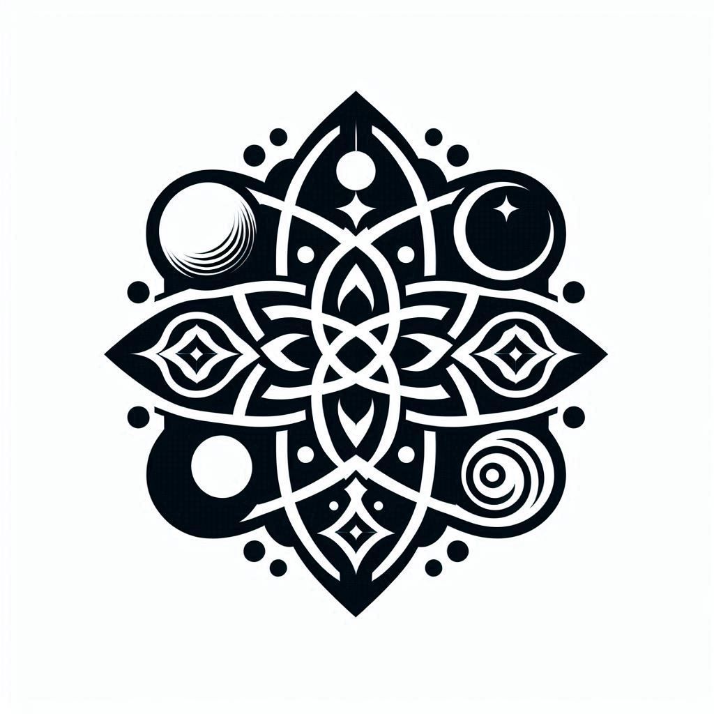
Often, students seek to surpass their masters. But, what happens when you are both master and student? You become a sword that sharpens itself as it slices through adversaries. With a newfound fondness for Egyptian mythology and Taoism, we had plenty of inspiration for the logo. Our first few variations flirted with imagery of the sun gods Helios and Ra, and even Christian iconography of the Son of God. Ultimately, we returned to what felt most authentic: Greek philosophy. This made our design a Greco‑Roman affair, though echoes of earlier influences still linger. The challenge was clear: how do you create a logo that stands equal to the name Quintessential Arts? How do you encapsulate myths spanning centuries in a single 1024 × 1024 illustration? The transition shifted from the aloof philosophy of “The Champagne Theory” to a Zen‑like state infused with the wisdom of Aristotle and Marcus Aurelius—philosophers who dedicated their lives to discourse. We are, in many ways, the product of their dialogue and their ink. It seems they wrote from the very beginning with the foresight of our existence centuries later. Thus, in creating this logo, we aimed to reflect everything we represent: a belief in a harmonic structure built from the four mutable elements that compose the heavens, plus the incorruptible fifth element—æther.